The product as art direction
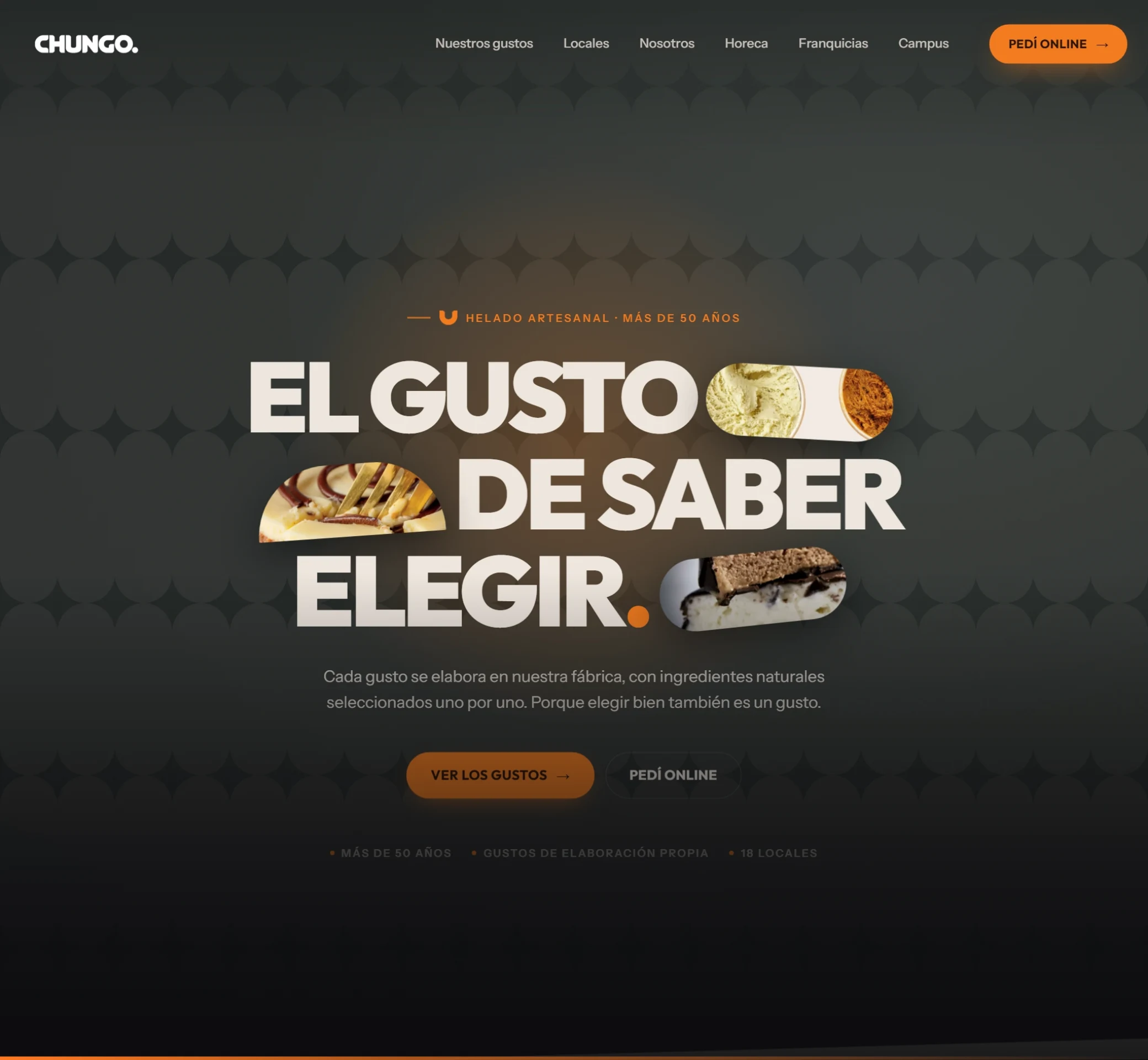
Chungo has been making artisanal ice cream for over 50 years across 18 stores. The brief was a site that felt premium and appetizing without losing the neighborhood character of the brand.
The idea: photos inside the headline
The headline —"The taste of knowing how to choose"— doesn't stand alone: photo capsules of the ice cream sit between the words, rotated and floating. The product doesn't wait for a gallery further down — it shows up in the first line you read.
What it solves
- Online ordering always visible, in the header and repeated along the journey.
- Browse by flavor and by store — the two real reasons someone visits an ice cream shop's site.
- Sections for the other audiences: Horeca, Franchises, and Campus, without stealing focus from the end customer.
- Motion with intent: brand pattern in the background, staggered entrances, and micro-interactions on buttons and cards.
How it was done
Four cover versions presented side by side to pick a direction, then six rounds of refinement on the chosen one. Comparing options — instead of defending a single idea — is what unlocked the decision.
Delivered with Rotundo Media Group, the studio I've worked with since 2022.